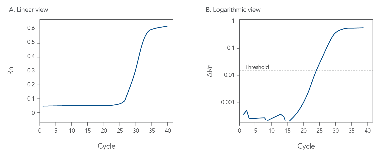
Good qPCR amplification curves should look like Figure 1. During probe-based qPCR assays, fluorescence is released from the probe as DNA polymerase copies the template or target nucleic acid sequence. The exonuclease activity of thermostable DNA polymerase hydrolyzes the probe, thus separating its 5' fluorophore from the quencher. The fluorescence of the degraded probe is divided by the fluorescence of an internal reference dye, ROX, to find the normalized fluorescence value, Rn. This value is then plotted for each cycle (Figure 1A).
Once the fluorescence values increase enough to reach the detection threshold of the instrument, the fluorescence will continue to accumulate for each cycle until the amount of the amplicon competes with the primers for hybridization, and a plateau in fluorescence accumulation is reached.
In Figure 1B, the intersection of the amplification curve and the threshold is defined as the Cq value, an approximate measure of the concentration of target sequences in the sample. The Cq values are evaluated relative to an internal control gene or to a standard curve created with serial dilutions of a known amount of target sample.

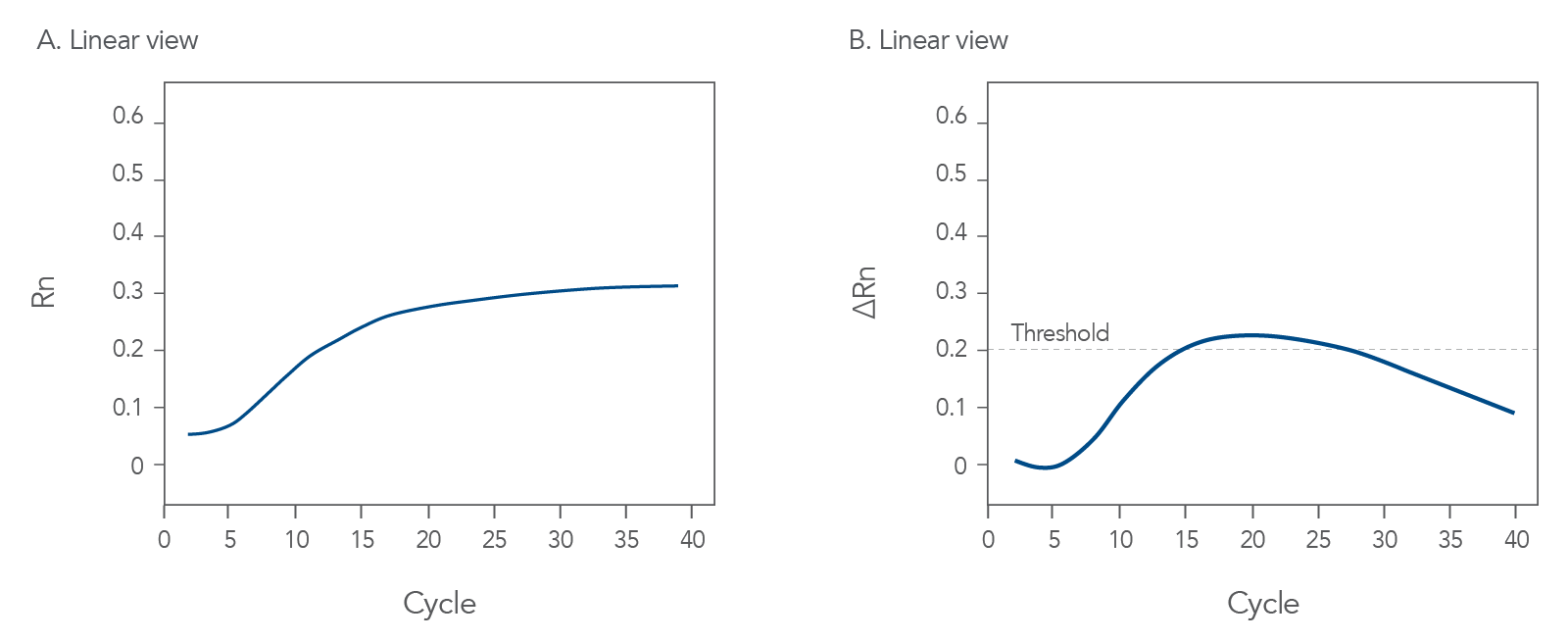
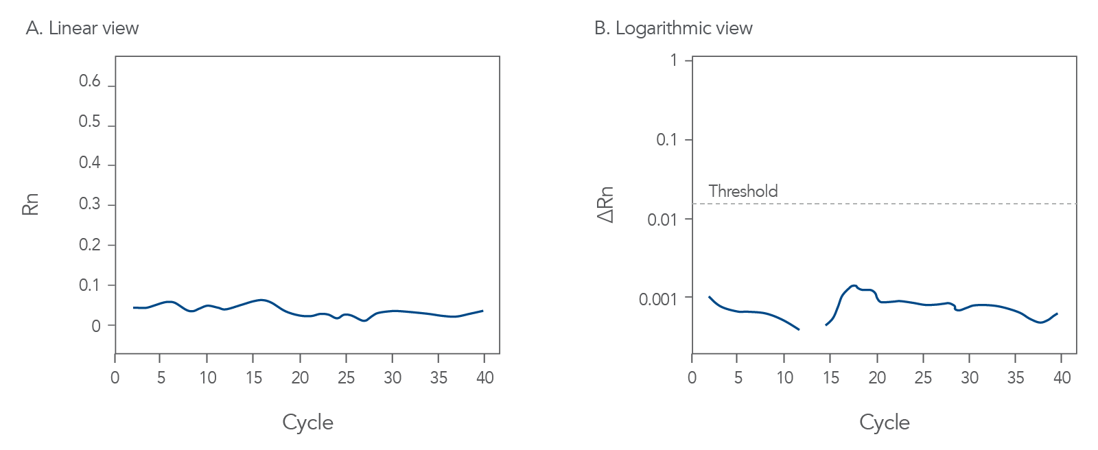
qPCR is a complex, multifaceted process, and several factors can cause suboptimal amplification. So sometimes your curves look like these (Figures 2 and 3):


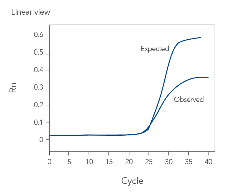
You might observe something very different from what you expect (Figures 4-7):


Thus, troubleshooting or generation of additional data may be required to achieve optimal qPCR results. But first you need to determine what is causing the flawed data.
The Real-time qPCR guide: Part 3—troubleshooting uses stylized drawings like the above and real amplification plots to help you identify the factors that could be compromising your results. These might include: sample degradation, low target copy number, incorrectly assigned dye detector, or overlapping fluorescent emission spectra. Just match your data to one of the images that best represents your own data and refer to the indicated guide section to learn what can cause such amplification curves and how to improve them.
Click here to register to download the Real-time qPCR guide: Part 3—troubleshooting.
For research use only. Not for use in diagnostic procedures. Unless otherwise agreed to in writing, IDT does not intend for these products to be used in clinical applications and does not warrant their fitness or suitability for any clinical diagnostic use. Purchaser is solely responsible for all decisions regarding the use of these products and any associated regulatory or legal obligations. Doc ID: RUO23-1689_001

